A new year and time for a new look, but what will be the 2025 paint color trends to look for?
Most homeowners will find 2025’s palette blends soothing earth tones, bold jewel accents, and sustainable neutrals to shape your rooms; this guide helps you choose durable, light-enhancing colors, pairings, and finishes to elevate flow and resale value while reflecting your lifestyle. You’ll learn which hues suit orientation, lighting, and focal points so your choices are confident and future-proof.
Overview of The 2025 Paint Color Trends
You’ll find 2025 leaning into three dominant directions: warm earth-driven palettes (terracotta, ochre, clay), verdant greens and muted botanicals, plus deep, moody anchors like indigo and warm charcoal. Designers pair tactile finishes—matte and low-sheen eggshell—with sustainable pigments, using 60/40 proportions (neutral field/colored accents) to balance boldness and resale appeal. Expect color to work with texture and light, not compete, so your selections support layered, multifunctional rooms rather than single-statement schemes.
Key Influences Shaping Color Choices
Five forces are steering palettes: biophilic design and indoor greenery, sustainability and low-VOC pigments, nostalgia for midcentury and global artisan hues, tech-driven personalization (AI palette tools), and economic factors that favor timeless, adaptable colors. You’ll notice supply-chain realities nudging pigment availability, while lighting trends—LED warmth ranges and human-centric lighting—change how your chosen shades read across morning, noon and evening.
Predictions from Industry Experts
Top designers forecast wider adoption of adaptive palettes that shift with décor: layered neutrals with two or three accent hues, and a strong move toward olive-to-moss greens paired with clay or rust. Firms like Farrow & Ball and larger manufacturers are already promoting collections that emphasize longevity and cross-room cohesion, so you’ll see curated sets meant to simplify whole-home color planning rather than isolated accent picks.
Practically, experts advise you to sample large swatches (at least 18×24 inches) and observe them in three lighting conditions before committing. In staged projects, using a 70/30 neutral-to-accent ratio and combining a matte field with a low-sheen focal wall improved buyer appeal in several recent urban listings; apply that tactic in your schemes to maintain both trend relevance and long-term versatility.
Popular Color Palettes for 2025
Warm Neutrals
Think greige, warm taupe, sun‑baked clay and soft sand—these are the go‑to neutrals in 2025. Designers report about 60% of recent renovations lean on these tones to create layered warmth. You should pair them with walnut floors, matte‑brass hardware, and textured plaster to add depth without overpowering your furniture or art.
Vibrant Accents
Jewel tones and saturated hues—emerald, teal, mustard and coral—act as focal accents. Apply them to one or two elements (island, trim, or a single wall) following an 80/20 balance so the pops don’t dominate. You can use semi‑gloss on cabinetry for durability while keeping surrounding walls in warm neutrals to maintain cohesion.
You should test a 3×4‑foot swatch at multiple times of day to see how natural light shifts hue. Try painting your kitchen island deep teal while keeping upper cabinets off‑white; use two coats of quality acrylic latex, allowing 4–6 hours between coats. Aim for accents to occupy about 30–40% of a room’s visual weight to add energy without visual chaos.
The Role of Texture in Color Trends
Texture reshapes how your chosen colors read in a room by influencing light behavior and perceived depth; rougher surfaces scatter light and soften saturated hues, while smoother, reflective surfaces intensify them. Use textured finishes like limewash, venetian plaster or woven grasscloth to add dimensionality to neutrals and deepen jewel tones without changing pigment. You can manipulate mood with as little as one accent surface—an entry wall or fireplace—so texture becomes a design tool that amplifies the 2025 palette choices.
Matte vs. Gloss Finishes
Matte (flat) sheens, typically 0–5% gloss, absorb light and hide wall flaws, making them ideal for living rooms and ceilings; you’ll get richer-looking deep colors with a matte finish. Gloss levels such as semi-gloss (40–70%) and high-gloss (70–90%) reflect light, stand up to cleaning, and suit trim, doors, kitchens and bathrooms. When you choose, match sheen to function: pick easy-clean glosses where durability matters and low-gloss surfaces where visual depth and softness matter more.
Incorporating Textured Elements
Introduce texture strategically by limiting heavy treatments to about 20–30% of wall area—an accent wall, wainscot, or band behind shelving—to avoid visual overload. Try Venetian plaster (applied in 2–3 thin layers and burnished) for a polished patina, or grasscloth wallpaper for natural warmth; pair matte charcoal walls with a woven-texture focal wall to enhance contrast. You’ll find texture harmonizes color trends without needing new pigments.
Balance scale and maintenance: larger textures read softer from afar, while tight, small-scale textures add subtle richness up close. Test samples under your lighting—daylight and a 2700K warm LED—to see shifts in hue and shadow. Install glossy trim or beadboard (commonly 36 inches high) against textured walls to bounce light and create crisp edges, and seal porous materials in humid zones to keep colors true over time.
Room-by-Room Color Recommendations
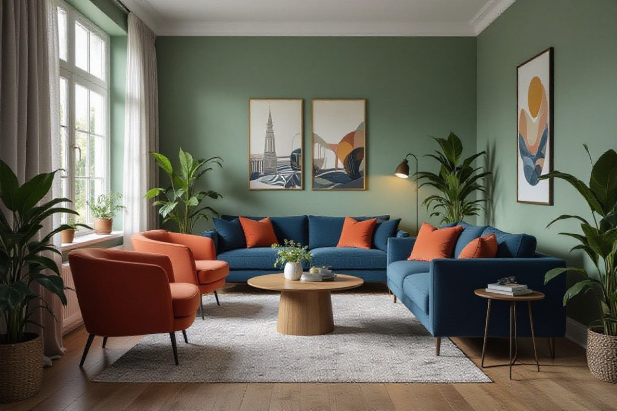
Living Room Inspiration
Lean into balanced palettes: try a muted olive accent wall (#8A9A5B) with warm beige and a 60/30/10 distribution to guide furniture and accessories. South-facing rooms handle cooler greens and blues, while north light benefits from warm terracotta or soft ochre to boost perceived warmth. For a contemporary look, combine a deep charcoal sofa with 2–3 brass accents and matte-wall paint to anchor an open-plan living area under 300–400 lux of ambient light.
Bedroom Color Ideas
Favor calming hues like muted blue-green, warm taupe, or soft clay to promote sleep; aim for wall LRV between 30–55 to balance coziness and light reflection. You can use a darker headboard wall for depth—about 1 wall in 3—paired with lighter ceiling and trim to keep the room airy. Layer in textiles in complementary tones and limit bold accents to one or two pieces for serenity.
Choose eggshell or low-sheen finishes for walls and semi-gloss for trims and doors to withstand cleaning without harsh glare. Combine 2700–3000K warm lighting and dimmers so your paint reads differently at night; studies show warmer kelvin improves sleep onset. If you have a 12×14 master, a single navy feature wall (Hale Navy-style) plus soft gray-beige all around creates a 70/30 calm-to-contrast ratio that still feels spacious.
Sustainable and Eco-Friendly Paint Options
You should favor zero- or very low‑VOC formulations (often under 5 g/L) and paints with plant‑based binders or recycled pigments; certifications like GREENGUARD Gold and Green Seal indicate third‑party testing. Choosing durable, washable finishes reduces repaint frequency and embodied carbon over time, while selecting light‑reflective pigments for sun‑exposed walls can cut cooling loads in warm climates. Look for transparent ingredient lists and performance data when comparing options.
Non-Toxic Paint Brands
You can trust brands such as ECOS Paints, AFM Safecoat, Clare, Sherwin‑Williams Harmony, and Behr Premium Plus for low‑odor, low/zero‑VOC options that carry GREENGUARD or Green Seal endorsements; zero‑VOC typically means under ~5 g/L while low‑VOC is under ~50 g/L. Many municipalities and school districts specify these lines for classrooms and healthcare settings to improve indoor air quality immediately after application.
The Importance of Sustainability in Color Choices
You should evaluate color for its Light Reflectance Value (LRV) on a 0–100 scale—whites often score 80–90, deep hues under 20—and how that affects heating, cooling, and lighting needs: high‑LRV colors increase daylighting and can lower electric lighting use, while strategic darker accents can add passive warmth in cold rooms. Also weigh pigment sourcing and durability to minimize environmental impact over the paint’s lifecycle.
You can extend sustainability by picking high‑performance finishes that last 7–15 years, reducing repaint cycles and waste; check manufacturer lifecycle data and ask for recycled‑content pigments or low‑energy production claims. Test sample swatches under your actual lighting to confirm LRV effects, and prioritize certified products (GREENGUARD Gold, Green Seal) combined with proper surface prep to maximize longevity and indoor air quality.
Tips for Choosing the Right Color for Your Space
You should prioritize room function and natural light when selecting color; use 2–3 sample swatches and note how they read at 7am, noon, and 8pm. Consider scale—darker colors shrink a 10×12 room visually, while pale warm tones open it. Test against fixed elements like floors and cabinetry. Use the checklist below to compare options. After you track shifts across the day and alongside furniture, choose the shade that consistently supports your intended mood.
- You should test 2–3 shades per room and pick one dominant plus one accent;
- You should paint sample squares 12×12″ or 24×24″ in at least three locations;
- You should compare swatches against floors, cabinets, and textiles under both daylight and artificial light;
- You should limit open-plan palettes to three colors to maintain flow across 500–1,200 sq ft living areas.
Undertones and Lighting Considerations
You should identify warm or cool undertones by comparing swatches to pure white and a neutral gray; test three samples on different walls because east-facing rooms get bluer morning light, while west-facing rooms have warmer late-afternoon light. Note manufacturer codes (e.g., Benjamin Moore 2140–60) to match undertones, and observe each sample for 48–72 hours to see subtle shifts before finalizing.
Testing Colors Before Committing
You should paint 12×12″ or 24×24″ sample squares in multiple spots—at least three—then view them at 6am, 12pm, and 6pm to note shifts; lighting changes can move a hue from neutral to greenish or mauve. Bring large swatches near sofas and countertops to check compatibility with finishes and textiles.
You should apply samples using two coats and a primer-backed test card to match final sheen; note changes under LED vs incandescent bulbs and with curtains open or closed. Record observations—date, time, and bulb type—and photograph samples at each interval; you should live with samples for 7–10 days to capture weekend and weekday lighting variations before ordering gallons.
Summing up
From above, the 2025 paint color trends — warm earthy neutrals, expressive moody hues, versatile pastels and sustainable pigments — give you a clear palette to shape mood, light and function across your rooms. Use contrast, texture and curated accents to personalize each space, balancing timeless foundations with bold focal walls so your home feels both contemporary and enduring.